Branding
Overview
Truevenom is a Made-in-India sneaker brand for youth (16-26) seeking originality over knockoffs. The challenge was to craft a bold, minimal, and instantly recognizable identity, especially on the sneakers.
Approach
The branding features clean typography, a monochrome logo, and tech-inspired packaging with subtle circuit-like patterns, blending a modern, edgy aesthetic with a premium feel.

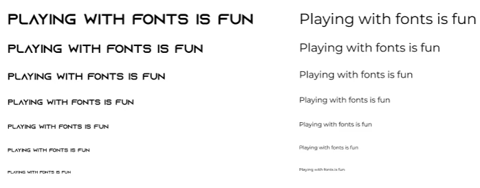
Montserrat
Logo Ideations
The approach for the Truevenom logo was to craft a bold and minimal identity that reflects authenticity, confidence, and youth-driven rebellion.

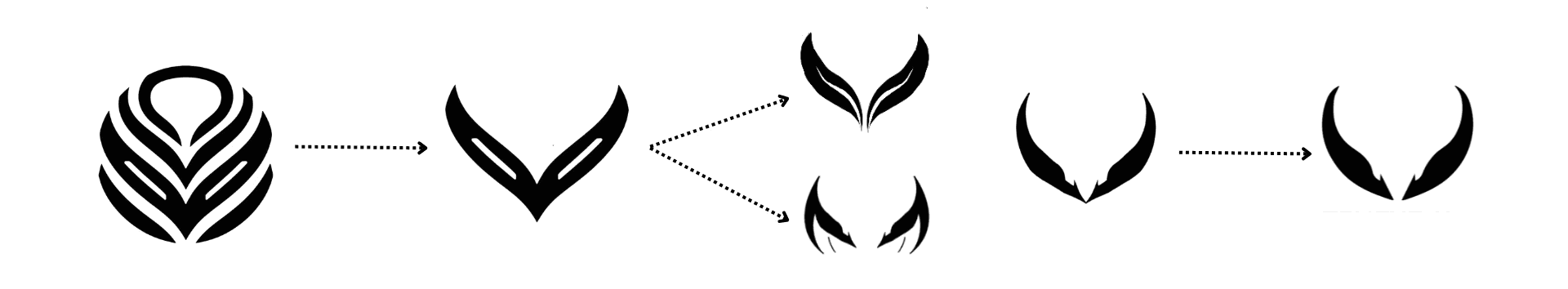
Final Logo
The Truevenom logo combines a sharp, fang-like emblem with a clean, custom wordmark to reflect the brand’s bold and rebellious spirit. The symmetrical icon suggests power, motion, and individuality—echoing the venomous edge in the name. Set in black, the logo feels strong, minimal, and versatile, making it instantly recognizable across sneakers, packaging, and digital platforms.
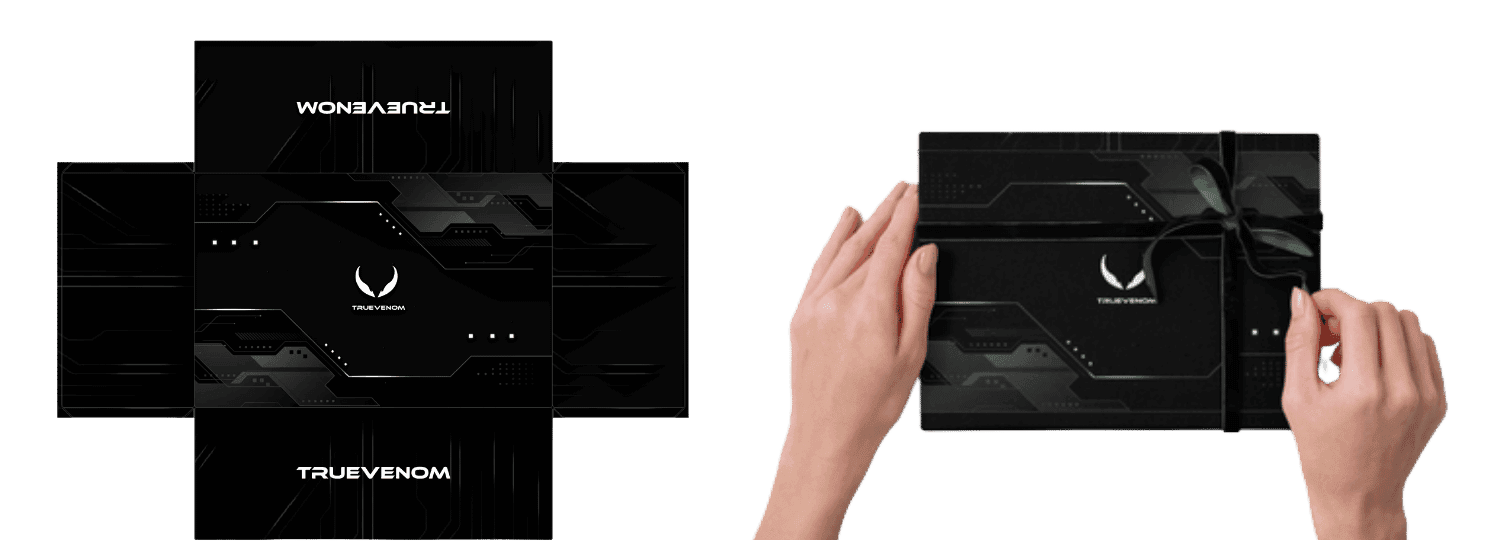
Packaging design
The Truevenom packaging features a sleek black box for black shoes and white box for white shoes with subtle circuit-inspired patterns, reflecting the brand’s tech-savvy, modern edge. Its minimal design and bold logo placement ensure a strong unboxing experience that feels premium and powerful

Black Packaging
White Packaging